
We hosted a Winnebago Buy Local expert panel a couple weeks back. I had the pleasure of being one of the marketing experts on the panel that answered questions about small business marketing.
Many topics were covered from media buying to branding. While discussing branding, I remember talking about how you have to trust your marketing professional. Business owners like to think that they are their target audience and that they know which shapes, colors, words, images, etc… will work better for their customers because “I am my audience, and I don’t like it”. Well, the truth is that this is a faulty way of thinking about the design process.
I had said during that discussion that if your designer says red is the best color to use, you have to trust them even if you don’t like the color red.
Well – I still stand by that statement, but I think it’s important to clarify something. Not all design professionals know what colors are best. Some of them like to think that every color will invoke specific reactions from people. They claim to understand “color theory” and “color psychology”. Usually, these people use meaningless industry jargon to make themselves sound better than they are. Too many “designers” read a fancy infographic and claim to know something about color in branding & design.
I am here to tell you, for the most part – color means a lot less than you think. Here is a great article from Entrepreneur.com that discusses this exact topic.
The psychology of color as it relates to persuasion is one of the most interesting–and most controversial–aspects of marketing.
The reason: Most of today’s conversations on colors and persuasion consist of hunches, anecdotal evidence and advertisers blowing smoke about “colors and the mind.”
To alleviate this trend and give proper treatment to a truly fascinating element of human behavior, today we’re going to cover a selection of the most reliable research on color theory and persuasion.
Read more at the source: https://www.entrepreneur.com/article/233843
I think the general concept of this article is wrapped up well when they say “So the idea that colors such as yellow or purple are able to invoke some sort of hyper-specific emotion is about as accurate as your standard Tarot card reading.” However, color does play a huge part in the design process for a number of reasons:
- Brand consistency
- Product Awareness
- Ease/Complication in Printing
- Company/Brand Personality
But that doesn’t mean that using the color blue will automatically make you trustworthy. Having a trustworthy business is a better way to make people trust you.
—
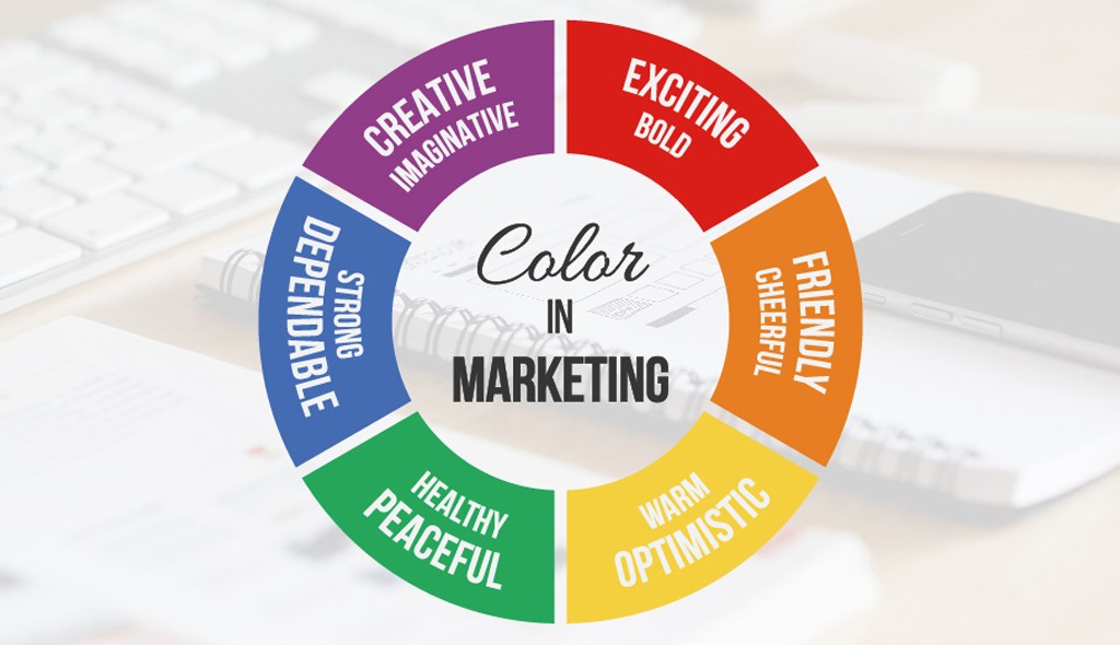
Featured Image Source: https://visme.co/blog/color-psychology-in-marketing-the-ultimate-guide/