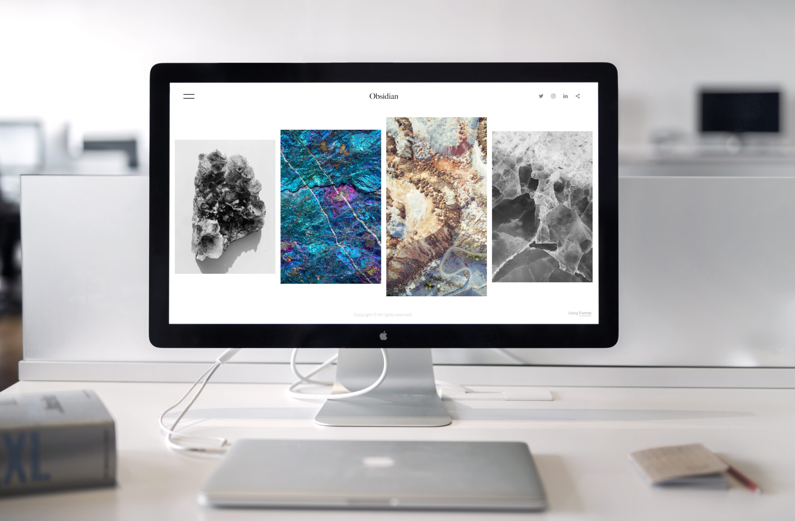
It is challenging for new businesses today to keep up with the changes in the digital landscape. Adapting to the evolving customer tastes and preferences and changes in design trend has become extremely significant. A website that does not cater to these factors can damage the credibility of the business.
Established businesses and veterans have cracked the formula by providing unique customer experiences of their brands. New businesses, however, are slow to catch up with these trends losing many customers in the process.
Perhaps this is because startup owners tend to prioritize money over customer experience. Moreover, creative design and a colorful homepage are usually not enough to keep the customer interested.
Creating a website that attracts customers to the final product requires in-depth analysis and planning. Here, we share some important details and guaranteed methods of designing a fabulous website that entices customers and convinces them to buy your product.
Lasting First Impression
The homepage is easily the most critical page of your website. It may not necessarily be the first page that a customer lands on. However, customers usually form opinions about your business and website after visiting the homepage. A cluttered and unprofessional homepage is not likely to attract customers to buy your product.
When customers are not impressed with your homepage, they will not hesitate to go to your competitors. Inspiring visuals created with a company logo design with the help of a seasoned brand design expert can have a positive impact on your customers.
Marketing Your Content
Not marketing the web content is equivalent to throwing free traffic in the bin. Content marketing is one of the easiest ways to attract viewers and eventually turn them into customers. Over the years, content marketing has evolved into one of the fundamental principles for success in organic search ranking.
Compelling and engaging content usually speaks the language the target market understands. This helps potential customers in understanding the brand and the identity it wishes to pursue. However, many businesses dampen their conversion rate by sharing excessive content. Let’s face it; no one wants to read long, monotonous paragraphs on each page. Short, sweet, and engaging content usually does the trick and hooks the customer to your business. Hence, your priority should be to use your content to excite and delight your customers, and if possible in the process educate them.
Don’t Confuse the Visitors.
Customers browsing your website often don’t know what they want. Providing a wide variety of actionable elements makes your customers wander around the website indecisively even more. Don’t make the mistake of creating many call-to-actions in the hope of attracting more customers. This leads to the opposite result as customers leave the website confused and misinformed.
Limiting the number of choices and smartly organizing information help customers focus on all the essential details.
Sales Funnel
All successful online marketers speak fervently in favor of free offers. They consider it the best tool for converting customers. They create an avenue for entry in the sales funnel which eventually leads to value jumps and sales.
However, this is not as straight forward as it sounds. You have to be careful going about the process the wrong way and end up falling flat on your face. Some pitfalls include identifying the wrong demographic, creating wrong channels, devising the wrong buyer journey, etc. It is therefore critical to identify your sales funnel right for the right customers. Free offers can come afterwards.
Loading Speed
There is nothing more frustrating than using a slow site. Slow site speed can affect the overall customer experience and subsequently affects the sales numbers. Pages with slow load time tend to have considerably higher bounce rates and low average page time. Research proves that longer load times affect conversions adversely.
You can reduce the loading speed by enabling compression to limit the size of your CSS, HTML, and JavaScript files that measure more than 150 bytes. Improving the response time of your server also helps. Fixing bottlenecks like insufficient memory and slow database queries help improve the server response time too. An optimized server usually takes less than 200ms to respond to the queries of the user.
Improving these minor technical aspects can impress your customers indirectly, and hopefully convert them.
Assist Customers Looking for Products
Website navigation also plays a critical role in securing customers. Arranging products by categories and placing them in drop-down menus help customers understand the products and services you offer without clouding their buying decisions.
A little tweak in website navigation goes a long way and is always helpful in leading the customers to the relevant products. Hiring a good website designer, familiar with the necessary navigation layout, and incorporates them when designing your page can help in increasing conversion without compromising on aesthetics.
Conclusion
Your business should not overlook the importance of your web design to attract customers. Your website design shapes the customer’s experience and directly affects the likelihood of conversion.
A badly designed website reflects poorly on the product quality you are offering, making the customers question your brand’s credibility. On the other hand, a well-thought-out design and presentation help attract viewers and convert them into loyal customers.
_____
Author Bio
Lucas Smith is a content strategist and freelance blogger who likes to write on topics related to small business, social media and brand design. He would love to hear your ideas, connect with him!

